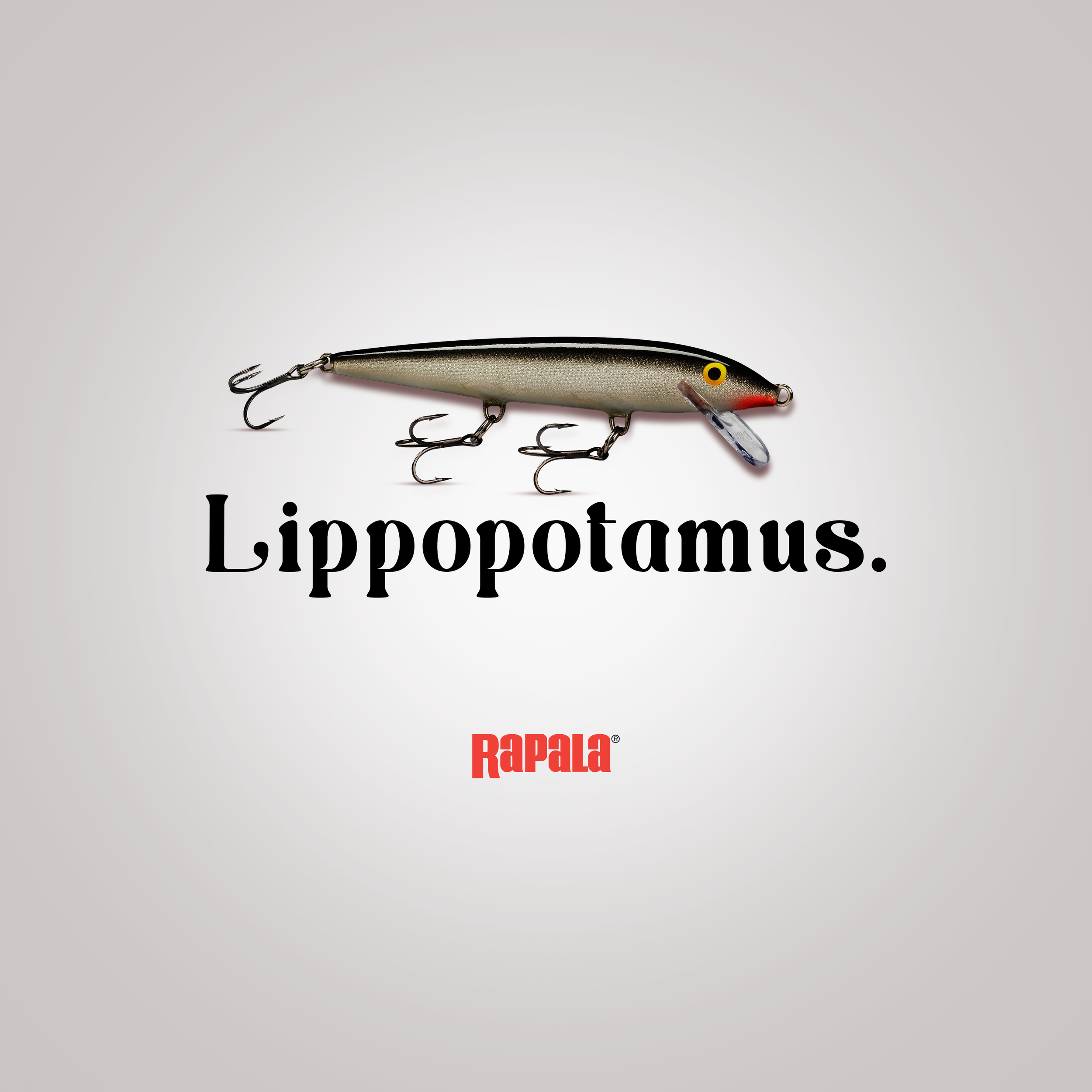
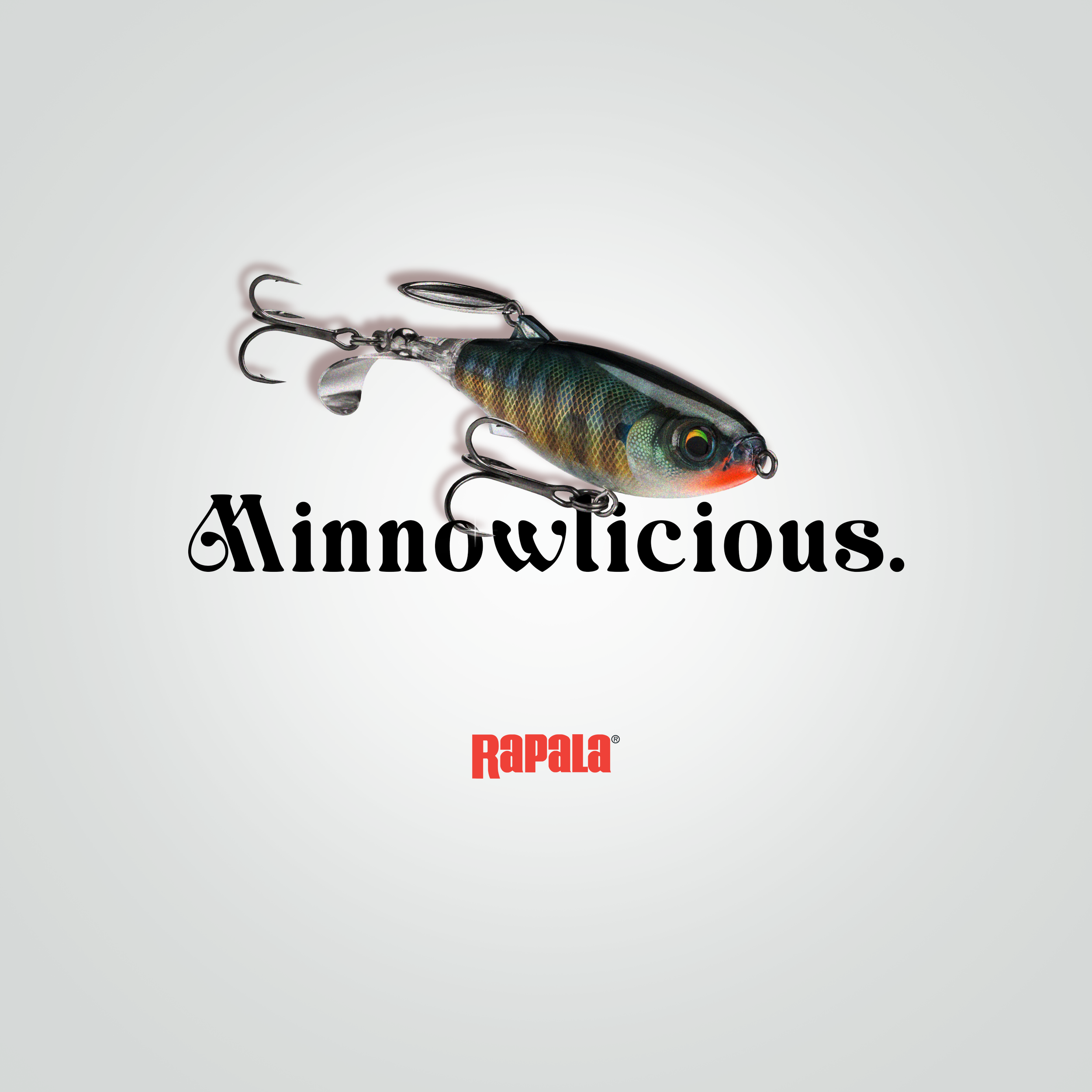
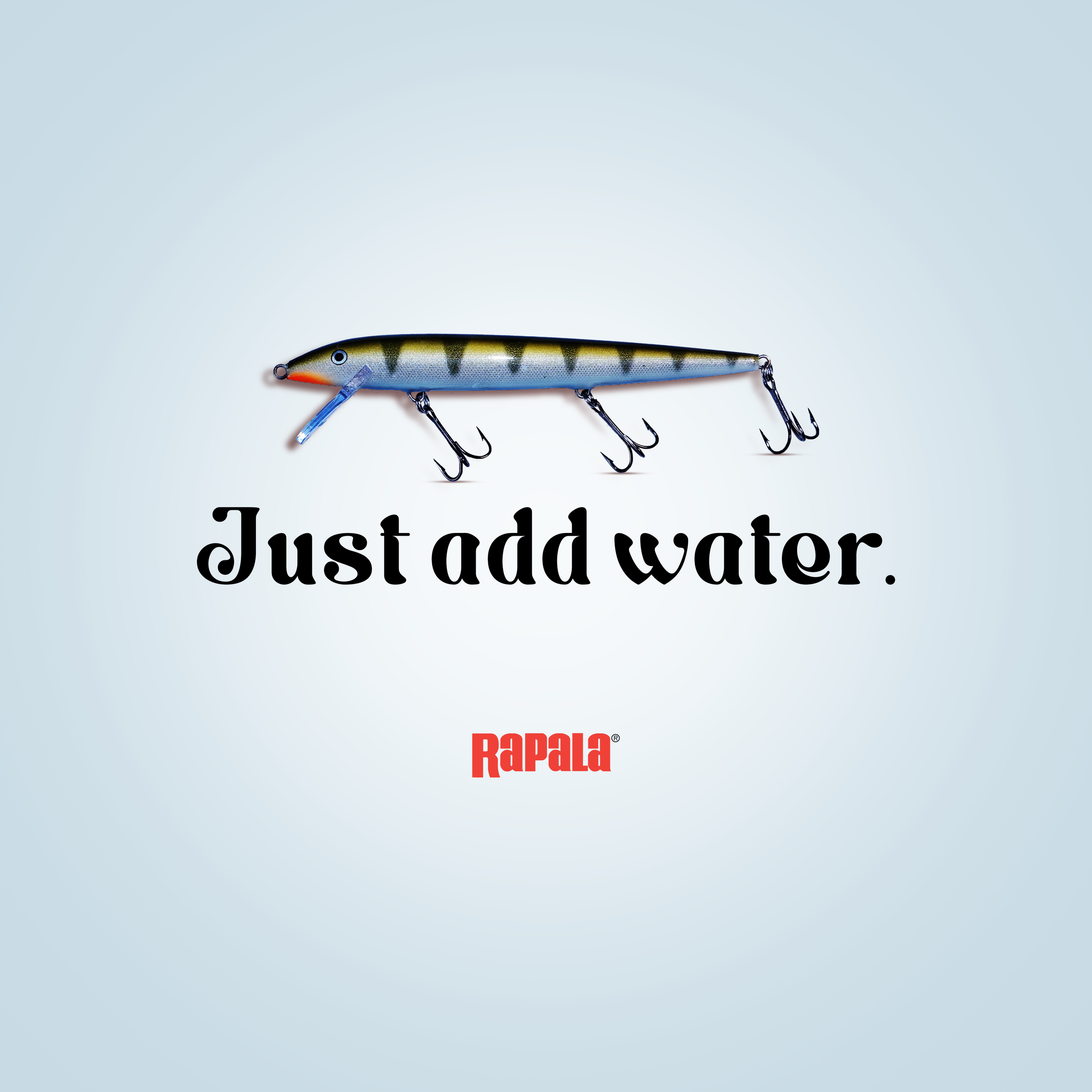
Rapala Refresh
I led a typeface refresh for Rapala, selecting a new font that preserved the brand’s rugged, outdoorsy character while improving legibility and consistency across platforms. After testing options for weight, spacing, and scale, I implemented the type system across digital and print touchpoints, then produced a series of ads showcasing the refreshed type—headlines that felt bold but authentic, body copy that read cleanly at small sizes, and layout treatments that honored Rapala’s visual heritage. The result was a cohesive ad suite that reinforced brand recognition while modernizing Rapala’s voice for current audiences.
Client
Rapala
Year
2025
Tools & Skills Used
Photoshop, Typography & Hierarchy, Visual Strategy, and Brand Storytelling
Rapala is a renowned Finnish fishing tackle manufacturer, known as the leading marketer for fishing lures. The brand refresh consisted only of a typeface change. After hours of brand research, I discovered some key words like: relaxation, calm, and adventure. I sifted through hundreds of typefaces until I finally landed on one that I believed represented those three words. Based on Rapala’s iconic billboard ads, my strategy was to place these new print ads on social media to target 24-53-year-olds.