
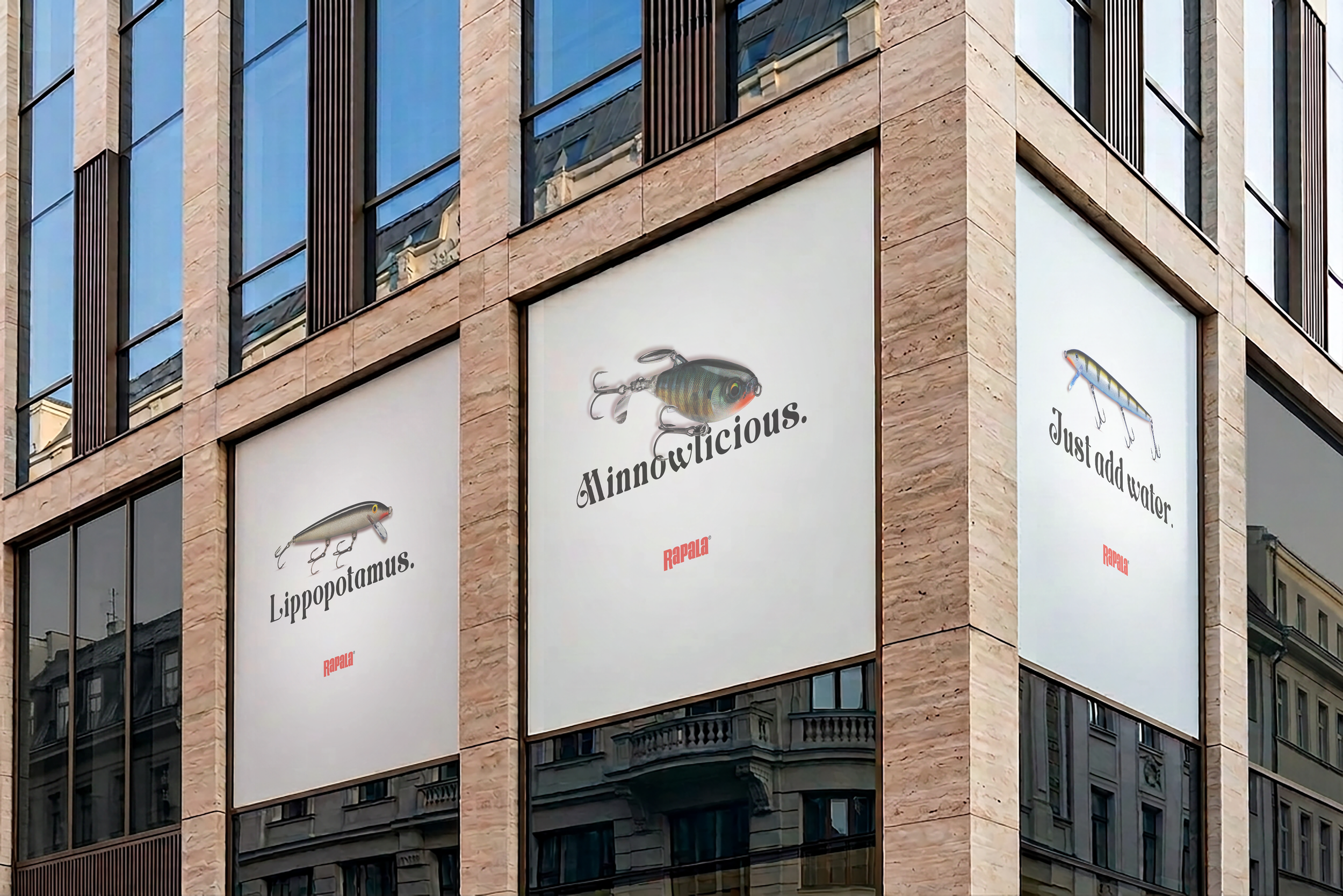
Rapala Refresh
Role: Graphic Designer & Art Director
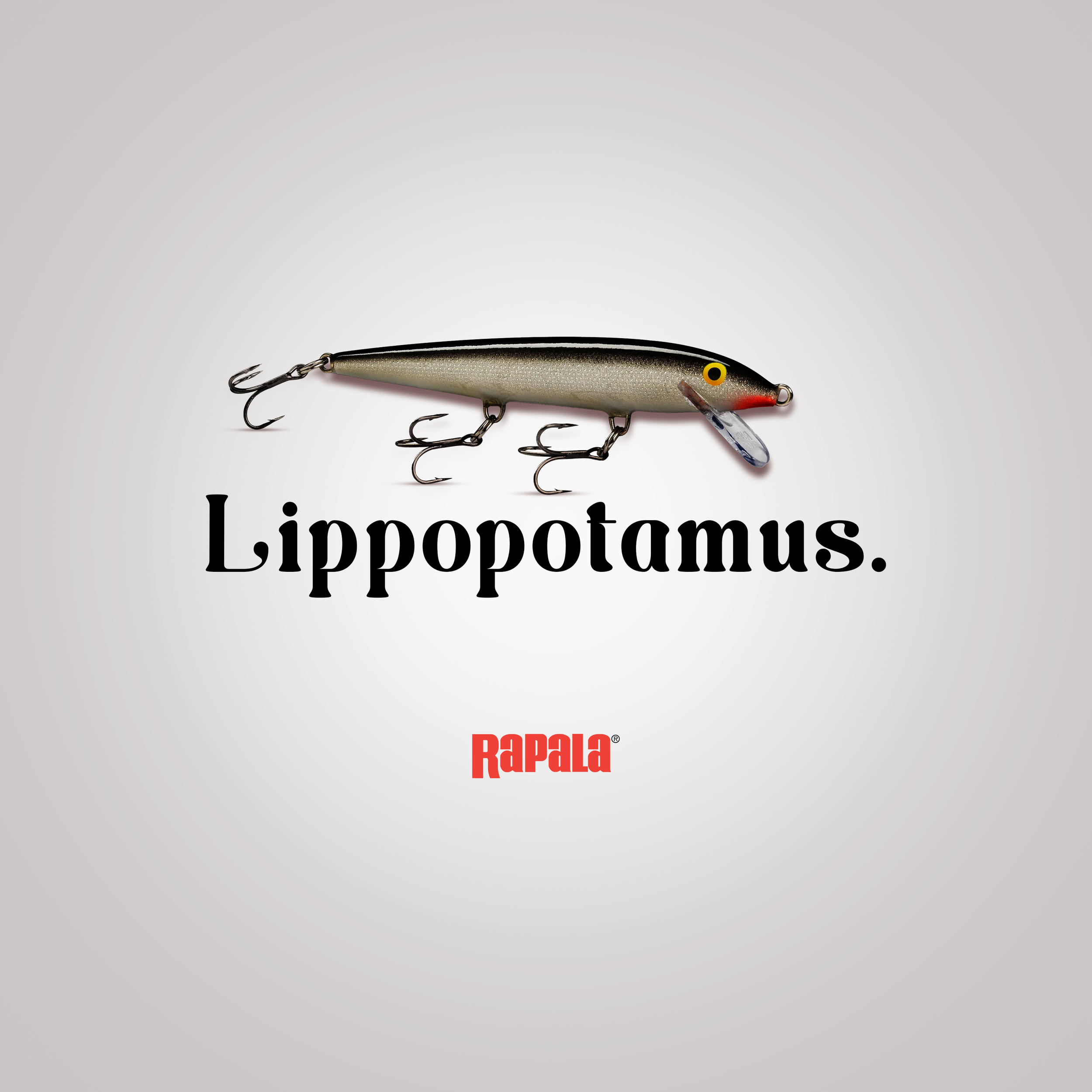
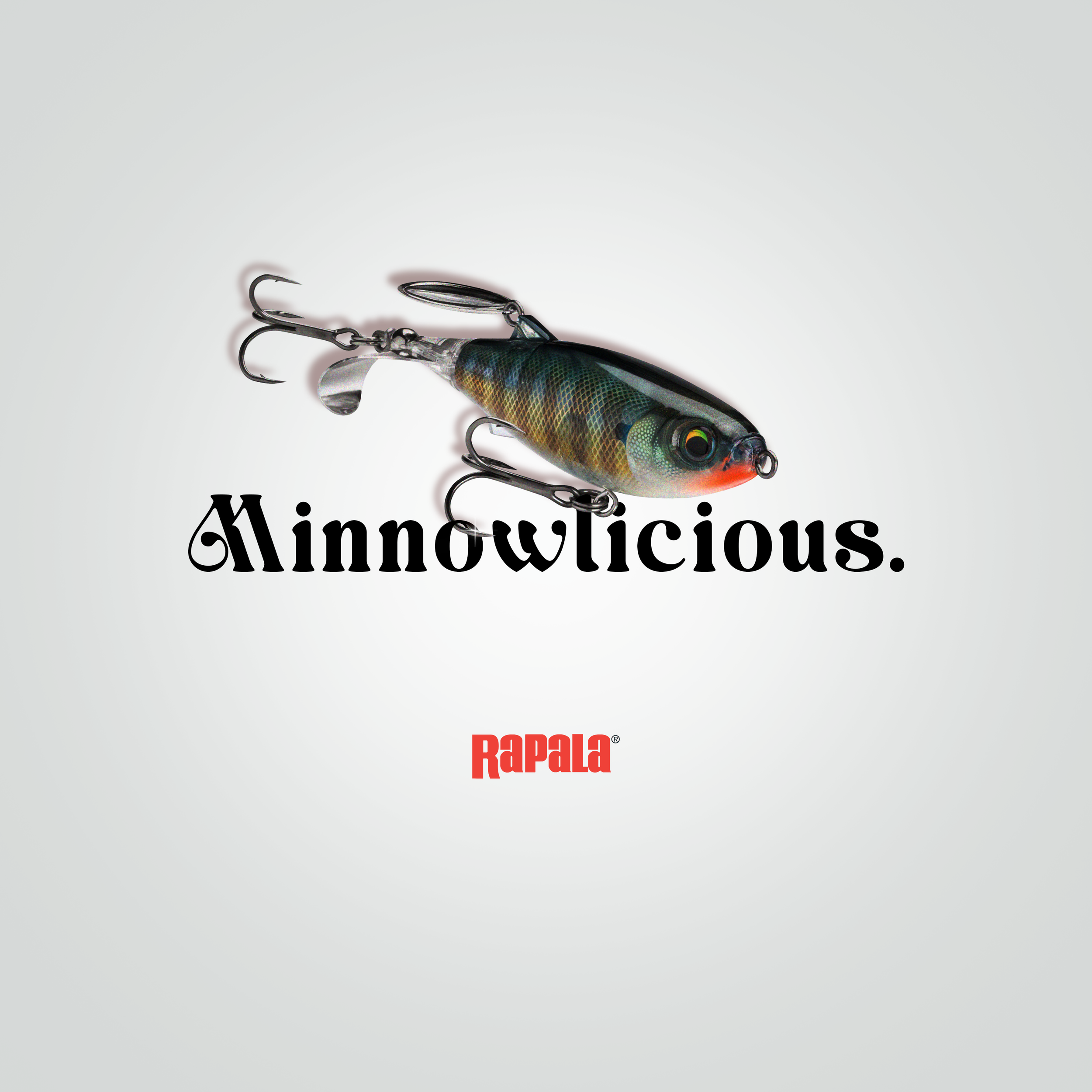
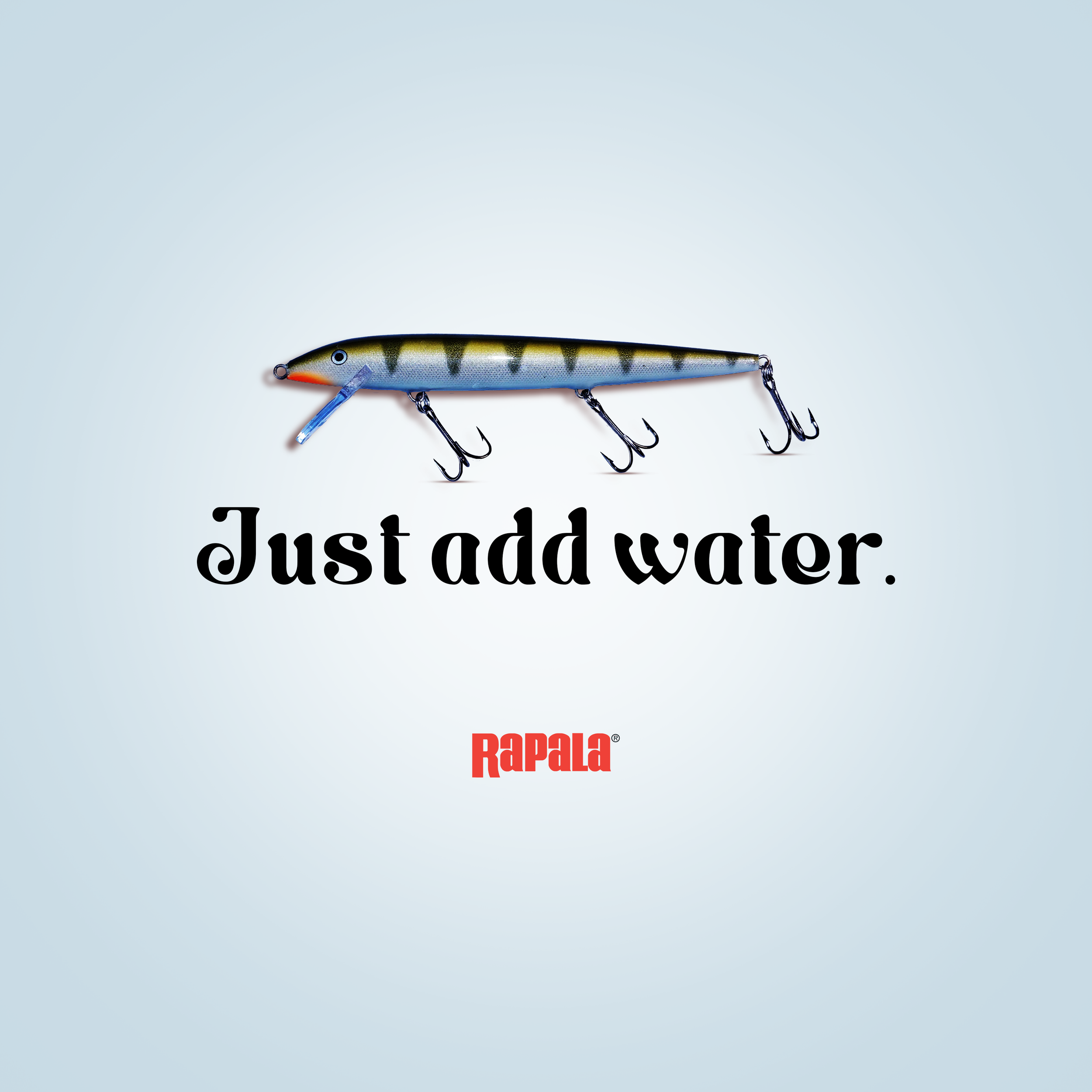
Problem: Rapala’s iconic billboard typography had become dated, creating an opportunity to refresh the brand’s visual identity and connect with a younger audience.
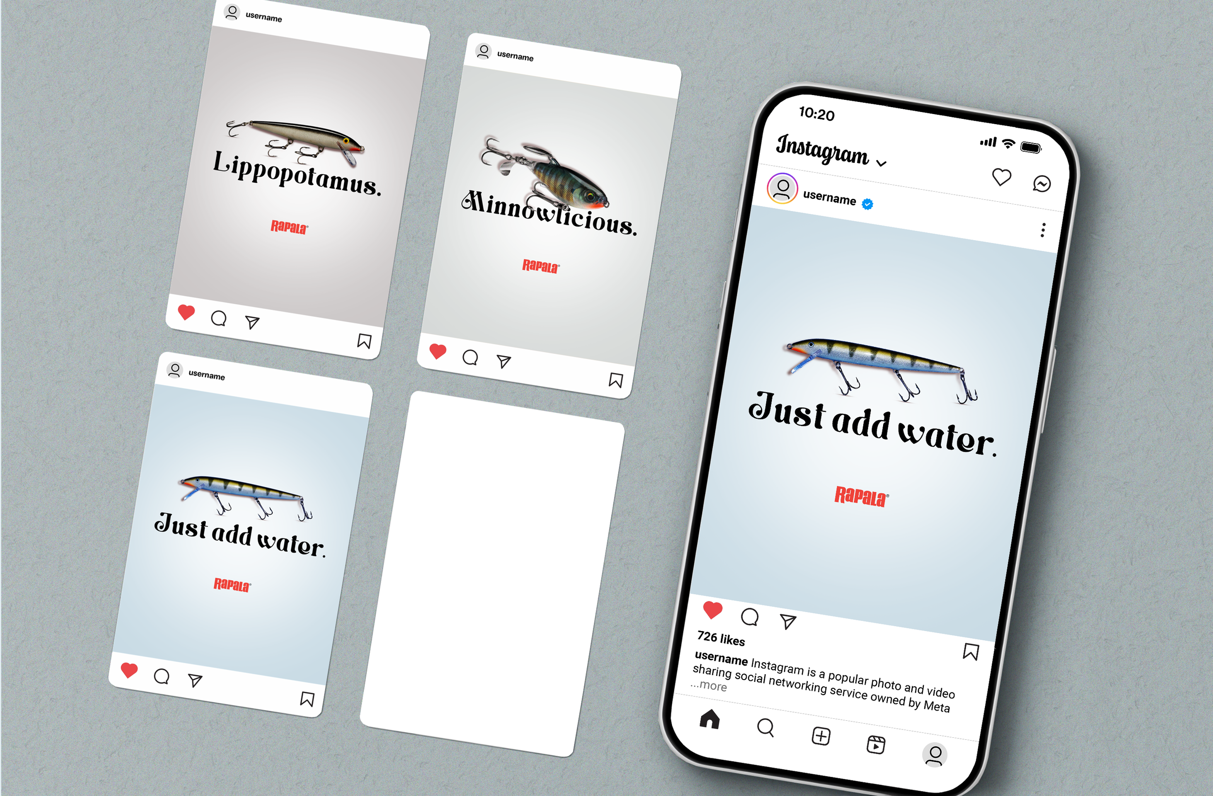
Strategy: I researched Rapala’s brand identity, products, and target audience to identify visual elements that could communicate the brand’s connection to fishing and the natural environment. I also explored how social media could provide a more engaging way to reach younger consumers than traditional billboard advertising alone. After hours of brand research, I discovered some key words like relaxation, calm, and adventure.
Concept: I selected Rocky Sunday for its organic letterforms and rounded contours. The open counters and flowing curves evoke natural forms, including aquatic life and winding riverbanks, reinforcing Rapala’s connection to the outdoors. The softer shapes also create a calm, approachable visual character that complements the early-morning fishing experience.
Execution: I developed social media graphics featuring Rapala fishing lures, using Photoshop’s Levels and Curves adjustments to enhance highlights, deepen shadows, and create stronger contrast between the products and their backgrounds. This helped the lures stand out visually, creating eye-catching compositions designed to capture attention in a fast-scrolling social media environment.
Client
Rapala
Year
2025
Tools & Skills Used
Photoshop, Typography & Hierarchy, Visual Strategy, and Brand Storytelling